
I have used a hybrid approach to my Project Life process for several years. I like the versatility, since I change my mind a LOT. I like that I can use digi kits in multiple ways, multiple times, and make edits to colors or add or delete areas of cards (or create my own). But I also like the dimensional elements of traditional scrapping. So my process has always involved both.
I have organized my photos for several years now using a
Library of Memories style, which makes finding photos and sorting through them
a piece of cake. They all already contain the date taken as part of the
filename so they are super simple to choose for weekly or monthly layouts.
My filing scheme consists of annual folders with subfolders
by quarter, then sub-sub folders for certain events or other non-event specific
happenings that I have lots of photos from, miscellaneous files for each month
for the random everyday photos, and a folder that contains all of the videos
from that quarter. Here are screen shots of what the tree looks like.
Event related

Miscellaneous

When downloading my photos, I use a naming convention that follows this format. They are always named with the date (yyyymmdd)_Event name or Misc_####. I initially started this sorting process using the event name first and the date second. I found when trying to make gifts for family on CD/DVD or other digital media, that the files ended up in alphabetical order, which left chronological viewing out the window! So I switched to the date first naming convention last year and have really loved it!
When I get ready to start a Project Life Layout, I usually
open a blank Design A template in Photoshop. I currently use CS5 version but
there are definitely newer versions, as well as this working in Photoshop
Elements. I created this template myself
but there are plenty of resources out there that are already pre-made for you,
like these.

I go back through my event folders for the month first, usually choosing one photo that best represents that event. Sometimes I really cannot decide and know I want to include more. So I do. Simple as that! If there are a LOT from a certain event I know I want to include, then I know it’s time for an insert and will start a new file in Photoshop using whatever template I want as the base of the insert. Here is a sample of one of my layouts with filled in photos.

I’m generally pretty good about choosing photos. I don’t tend to take too long on that part and usually stick with what I have chosen. I do take a few minutes to move the photos around and find which organization looks most appealing to me. This is another plus side of doing this part digitally. I can move them around as much as I want before printing and make sure they all flow well.
My next step involves choosing a kit. This is sometimes the
hardest part for me, since I have SOOOOOOO many digi kits to choose from. I try
to look at some of the dominant colors in the photos and choose a kit that
works best with those colors. I knew there was a lot of green in my photos, so
I looked for green cards in my kits first.
I currently have my kits all organized by designer, then
subfolders for each kit. But I also make sure to make a copy of all of all of
the cards and papers into a master file that houses ALL cards and papers from
all the kits I have so that I can scroll through them all easily to choose a
kit. This also makes it easy if a certain kit does not have enough cards of a
certain color and I know I just need one more of a certain color, I can quickly
scan over all the cards and find one that matches my needs. Here is a
screenshot of the kit organization:
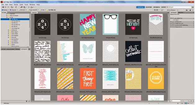
I usually choose a kit by first scrolling through the 3x4 filler cards. They are usually a good representation of the color schemes within each kit. Once I find a kit that works with the color scheme I need, I go to that kits file and choose all of my cards from that file. This is definitely the longest part of the process for me. I sometimes start with a certain kit, then completely change my mind once I start laying it out against my photos and start all over again with a different kit. Even once I have decided on a kit, I sometimes have 3-4 different options of cards in a certain spot before I finally decide which one works best. But so far, even though it is a time consuming process, I really love the freedom to be able to play around like that as much as I want. I am getting better at knowing what works for me and trying not to spend too much time during this process. Here is what my file would look like after the cards are filled in.

My next step is to add digi elements, like photo frames or word stamps, on the photos. Since I want these elements to print on my photos, I want them as part of the file before I send to print (or print at home). I really try to balance the elements as best as I can. Using a photo frame on one photo usually means I will also use it on a photo on the opposite side of the layout to balance it. Using an element like the Adventure tag on the photo of my son at the bottom, also means I balanced it with a tag on the top photo with the dog. It can add some color elements too, and also is a great way to fill in “white space.”

Next, I fill in the text. I generally type out journaling in Word to make sure I can utilize spell check. I will then transfer what I have typed into a text box in Photoshop and overlay it over the top of the journaling card. I will play around with font size and alignment a bit but try to make the font size fairly consistent within the same layout. I generally stick to no more than two fonts, and no more than 2 sizes of that font. A little graphic design trick I learned from the great Cathy Z.
I tend to layout
the text knowing that I want to leave space for letter stickers or other
dimensional elements. When I put this one together, I knew I wanted to add
letter stickers to the speech bubble card and something as a title on the card
next to it. I also left space to add number stickers for the year on title
card.

My digi process with the layout itself is then complete. I will save the photos as 4x6 files to send out to print and use an 8.5 x 11 file to throw cards into and print each sheet on cardstock from home. Once everything is printed, I cut out the cards and add everything to the pocket page. I am a fan of the rounded corners so I have been rounding my corners after cutting everything. This does take some time, but I think the outcome is worth it. I may try square corners at some point but I would want consistency throughout a whole album, so I have to be committed to it if I ever go that route. It’s the OCD in me.
The next step of the process is the really fun part for me…
adding elements. I have hoarded letter stickers, tags, and little elements for
years, and have a very healthy (or unhealthy) amount of elements to add to my
layouts. And viola, I am done! Here is
what the final product looks like.

Using my stash of Thickers, letter stickers by Simple Stories, and chipboard Stars by Studio Calico here.

And tags and MORE letter stickers!

The End!
No comments:
Post a Comment